What does the perfect pitch deck look like?
To answer that question, we selected the absolute best slides from our slide library, OpenDeck, and combined them to create "the best pitch deck ever".
This is the pitch deck no investor could pass.
NB: If you want to learn how to build it yourself, check out our step-by-step deck tutorial.
Table of Contents
Slide 1: Cover from the Kenjo deck
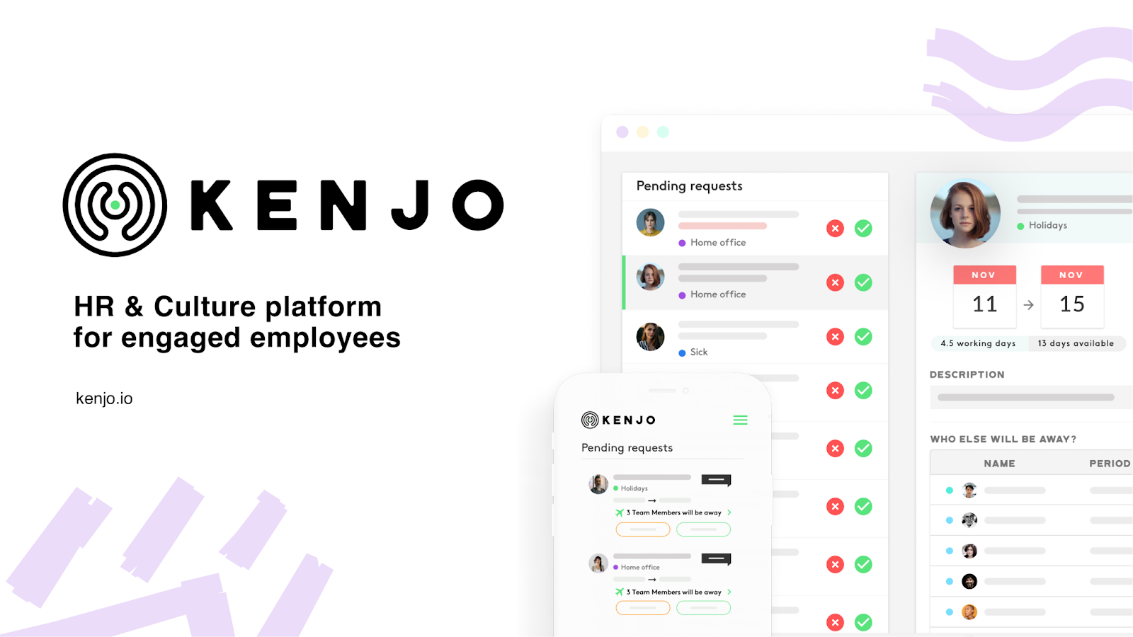
The Kenjo Cover slide is minimalistic yet impactful: company name in big, clear value proposition, beautiful product screenshots. No useless fluff like "Confidential", "Seed", or "January 2022".
The design gives a clean, modern vibe, which fits the brand.
The value prop is crystal clear: "HR & Culture platform for engaged employees". You understand what they do (HR platform) and the benefit ("engaged employees").
When you're an early-stage startup, you have to be explicit about your value prop. Avoid inspirational taglines like "The future of work". Instead, make your own cover slide extremely clear what it is you're doing. Leave no room for doubt. Kenjo did a great job at that.
Slide 2: The Hook from the Finix deck
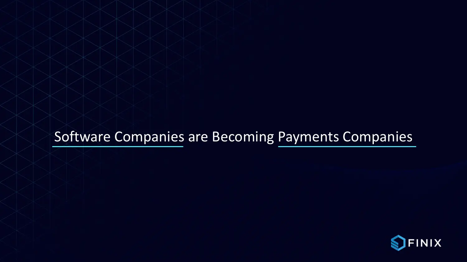
This slide by Finix is a great Hook. It eases the investor into the narrative with minimal effort.
The statement about software companies becoming payment companies suggests a massive opportunity, which is sure to tickle any investor. It's also a consensual statement - the “fintechization” of software is a well-known trend that will echo with pre-existing beliefs of the investors.
All in all, that's a great example of getting investors on board with your deck.
Slide 3 & 4: Problem/Solution from the Front deck

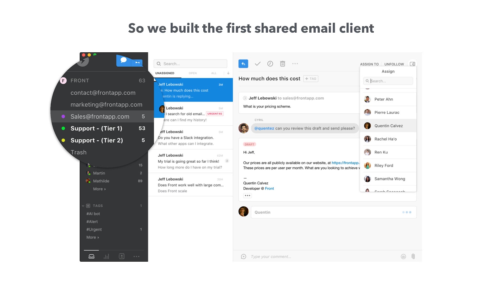
These 2 slides by Front are exactly what you want for a Problem/Solution combo.
The Problem slide leads with the "original sin" ("Email was never built to collaborate") at the top of the slide. It then results in 3 pain points listed at the bottom of the slide: Productivity slowdown, Lost business, Bad CX. This is made possible thanks to the simple yet elegant illustration in the center. Front doesn't tell you the problem, they show it to you.
The same goes with the Solution slide. Front elegantly introduces the solution by zooming in on the killer feature: the shared inbox. It's the answer to the Problem: we centralize what was once siloed.
The title of the slides reinforce that effect. "Email was never built for teams to collaborate... So we built the first shared email client." This one sentence split into two parts shows consistency from problem to solution.
All in all, a rock solid Problem/Solution slide.
Get free, instant pitch deck feedback 
Catch the issues investors would reject in seconds — before you hit send.
Slide 5: Product from the Apricity deck
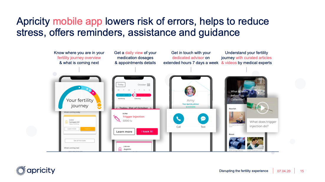
This Product slide is textbook perfect.
The title describes how the product works while the visuals walk you through the key features of the app, step by step.
It's visually appealing with just the right amount of written information.
10/10, would recommend.
Slide 6: Traction from the Yalo deck
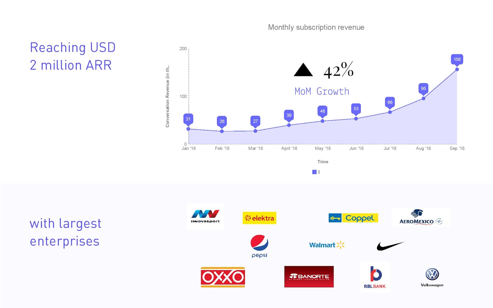
The Traction slide should show revenue and growth.
Yalo perfectly conveys both items.
Within 10 seconds, you understand that (a) they are at $2M ARR and (b) they are growing 40%+ MoM. That's all we need to know. The logos at the bottom are the icing on the cake and add social proof.
I also appreciate the month-by-month graph, which helps establish trust.
That's a lot of positive signals packed into one slide!
Slide 7: Business model from the Coinrule deck
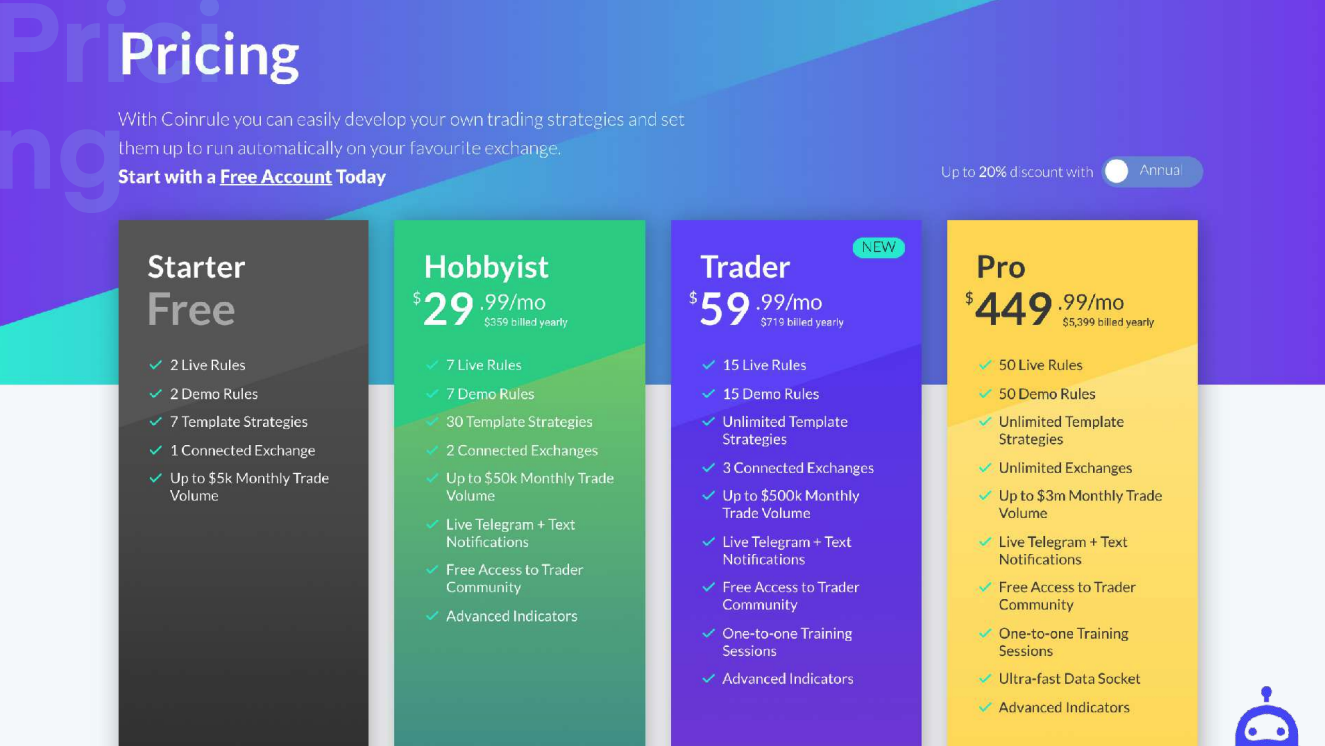
A good Business Model slide shows investors how you make money.
For most companies, it's enough to copy-paste a well-designed pricing. Case in point here with Coinrule. In some cases, you may want to highlight your ARPA (for marketplaces) or your margin (for hardware).
That's it. Keep it simple.
Slide 8: Market from the Klue deck
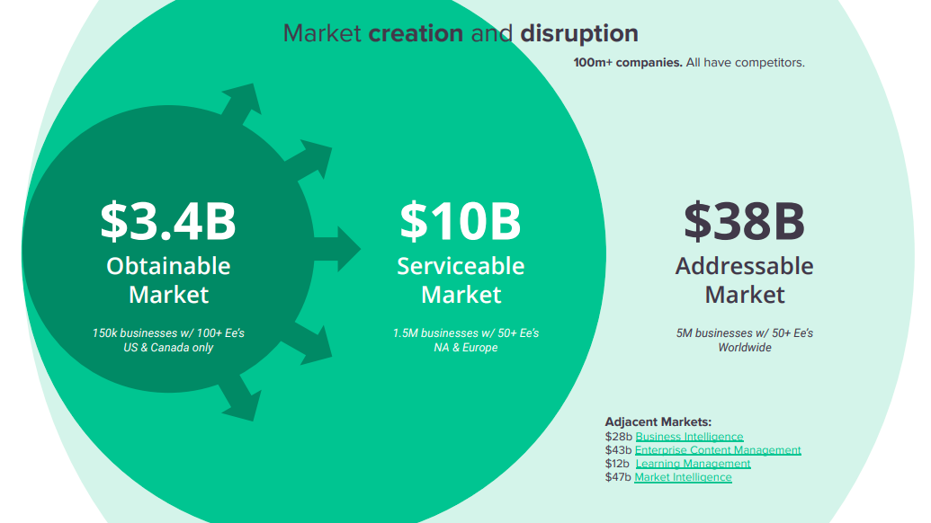
Market slides are fairly standardized.
You want to see a TAM, a SAM, and a SOM, broken down following a bottom-up approach, with a SAM over $1B. Klue nailed all these points with this slide, and they also managed to make it visually exciting.
Kudos to them.
Slide 9: Go-to-market slide from the OpenVC template
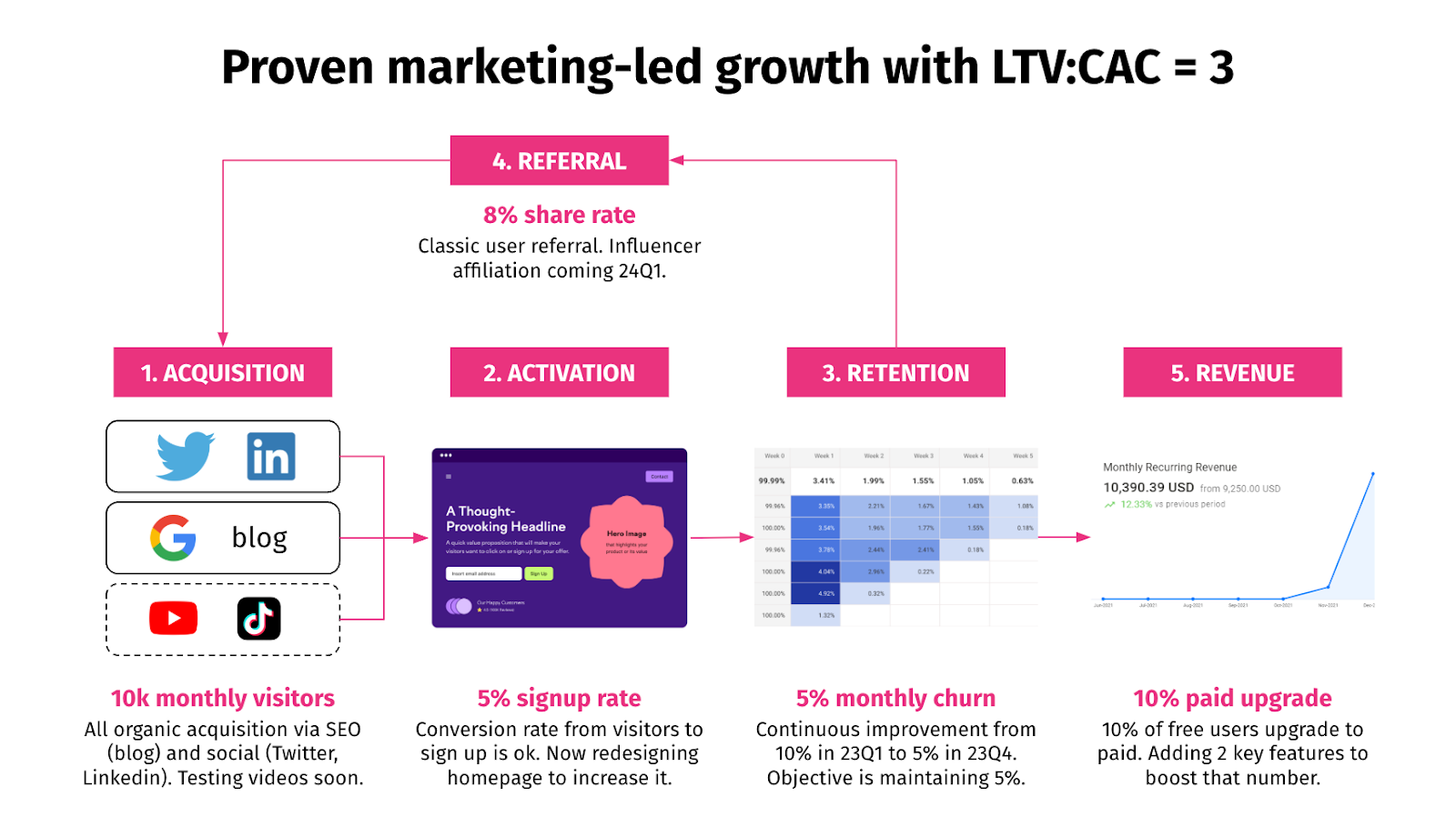
I couldn't find a GTM slide I really liked, so I created it myself. You can get it in our pitch deck template.
This slide addresses the typical flaws of GTM slides. First, we focus on a small number of relevant channels (socials, SEO, video) rather than a generic laundry list. Second, the GTM strategy is structured as a funnel showing clearly how traffic becomes revenue. Third, the key assumptions are quantified with actionable comments at each step of the funnel.
This slide shows a solid command of GTM for a marketing-led growth startup.
Slide 10: Competition from the Aircall deck
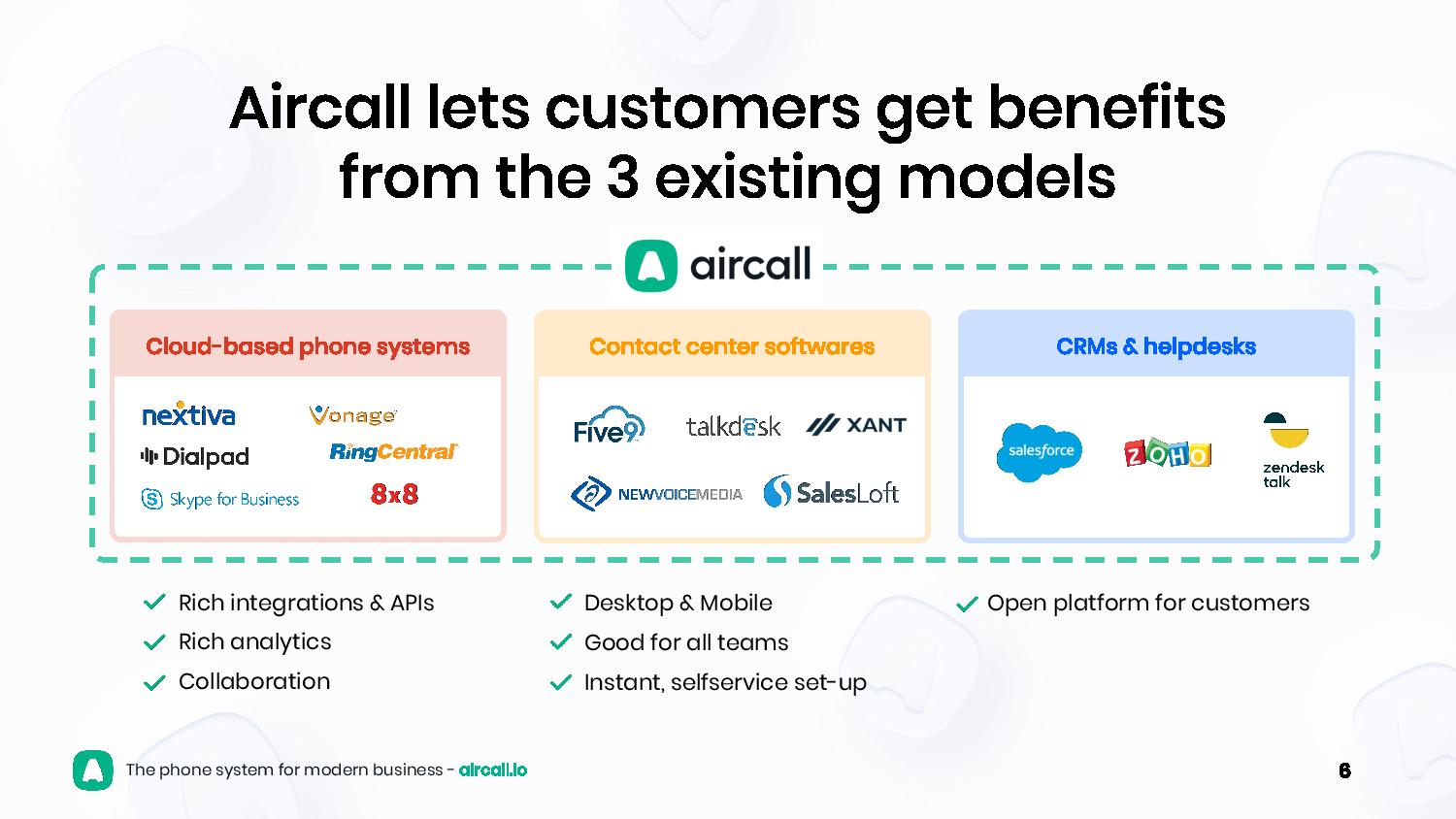
Most competition slides do a good job at explaining your positioning relative to other players, but fail short of explaining why you're superior.
I like this Aircall slide because it acknowledges the existence and value of each competitor, and builds upon that to highlight its own superiority as the “all-in-one” solution.
Slide 11: Team from the Almanac deck

This slide hits 100% of the nails on the head.
The action title highlights experience and passion, as it should. All the key executives are listed with their full names and clear, color, professional pictures - no advisor, no investors, no lower-level employees. The roles are shown, and also who is a cofounder (it matters to investors).
Finally, for each exec are listed their 3 key achievements in their professional and academic track record.
This is a prime example of an effective team slide.
Slide 12: Funding from the Gleamr deck
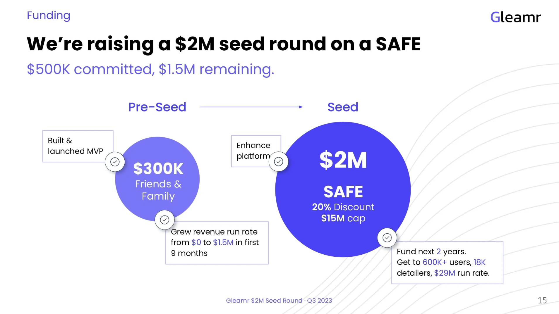
Finally comes the Funding slides, AKA "The Ask Slide".
Most funding slides break down the use of proceeds: "50% for engineering, 30% for sales, 20% for admin". As if anybody cared.
Instead, do like Gleamer: highlight objectives and momentum.
"With $2M in funding, we'll get to $29M run rate. And $500k is already committed."
That's all investors want to know.
(You may or may not add details about the terms, vehicles, previous rounds on a case-by-case basis.)
Slide 13: Back Cover from the Curastory deck
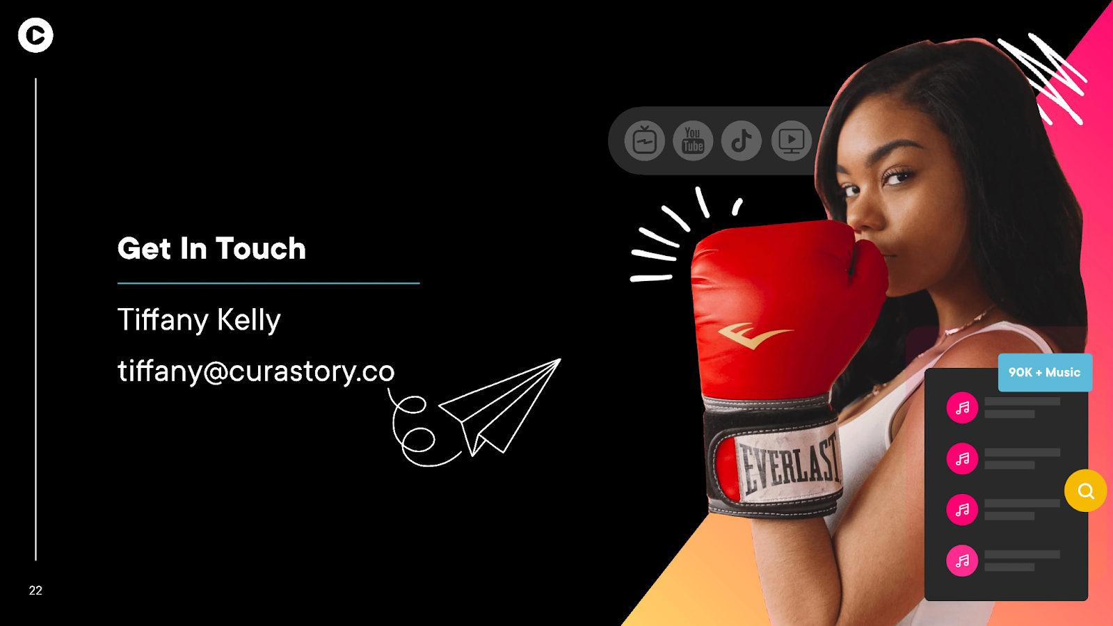
The last slide of your deck should be a call to action. Simple enough, yet rarely well executed.
The slide should contain the direct email address of the CEO. It may be a personal preference, but I dislike generic addresses such as "[email protected]". I like to know who I'm speaking with, and I would assume most VCs are the same.
So this Curastory slide is fine, and the design is very engaging as well.
Aaand... that's it!
What? Only 13 slides?
Yes. For one thing, investors are busy. Ain't nobody got time for a 40-slide deck.
More importantly, this 13-slide deck says everything that needs to be said: strong team, clear problem, proven traction, large market, and smart people willing to fund you. Wanna get in? Here's the contact info.
That's it.
A pitch deck is not supposed to explain everything about your business. Instead, it's supposed to generate desire, while being informative enough so the investor can qualify the opportunity, pass if it's a wrong fit, and save time for both sides.
As Saint-Exupery said "Perfection is achieved, not when there is nothing more to add, but when there is nothing left to take away."
That being said... you need to make the most of each section. That's why we recently launched our revamped pitch deck reviews. Powered by AI, our platform gives detailed, actionable feedback to improve the design and content of your pitch deck.
Then once you've perfected your slides, you can browse our investor lists and start sending pitch decks to investors (for free)!
Get free, instant pitch deck feedback
Catch the issues investors would reject in seconds — before you hit send.